All-encompassing stats are great for many things. WAR has become the standard for comparing baseball players because, more than any other stat, it encapsulates all of a player’s contributions in one number. On the offensive side, stats like OPS and wOBA provide a single stat that basically amount to offensive production per plate appearance. Stats like these are useful both in that they assign values to the different ways in which players provide value, and because universal measures allow easy comparisons between players. Want to know whether Giancarlo Stanton or Joey Votto was a more productive hitter last year? No number will give a perfect answer, but wOBA will get you close.
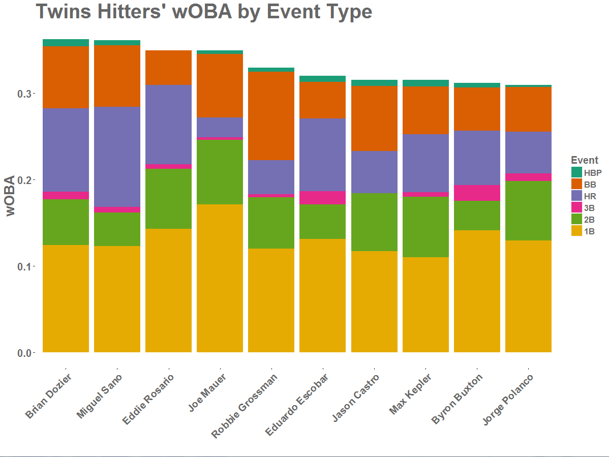
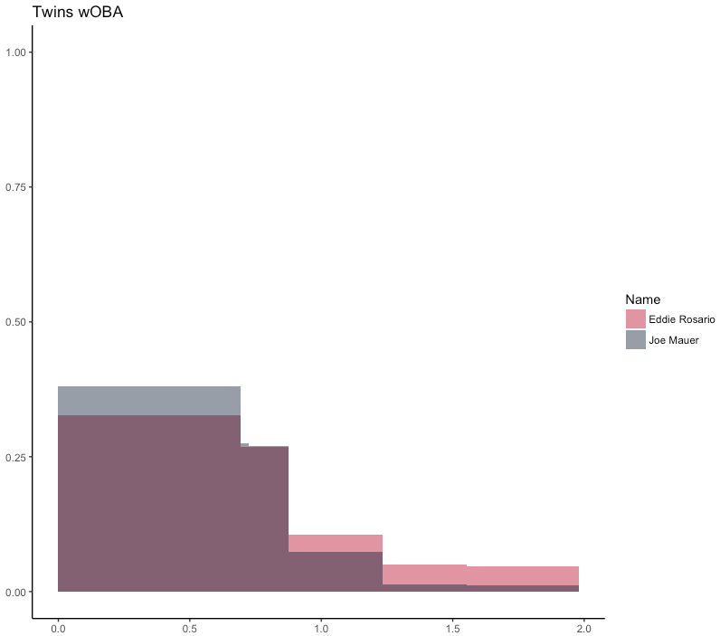
But rolling up all this information into one figure removes a lot of the color and nuance underneath. In 2017, Eddie Rosario and Joe Mauer each had a wOBA of .349, but in all other respects they were very different hitters. Triple slash lines (AVG/OBP/SLG) show this to some degree. Rosario had a power hitter’s line of .290/.328/.507, very different than Mauer’s .305/.384/.417. But this still doesn’t tell the whole story. A high slugging percentage could mean a decent number of home runs or tons of doubles and triples. On-base percentage can be boosted by both hits and walks. The more we break these stats down, the more categories we have to keep track of. This amount of information can be overwhelming.
Luckily, a good visualization can package this well. Let’s take a crack at creating one (or several). We’ll use the 2017 Twins as a test case.
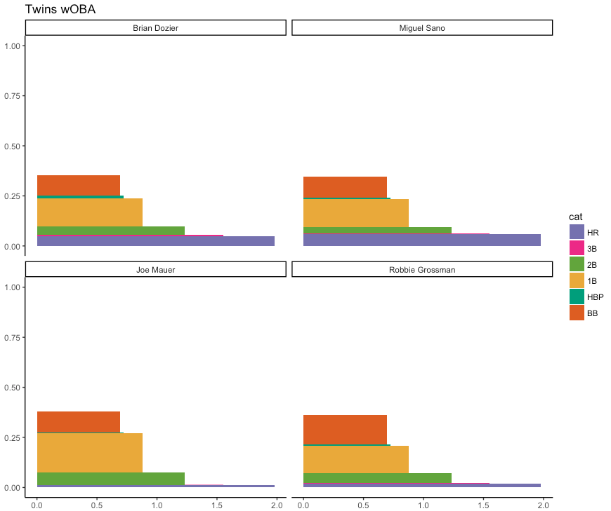
Here are bar charts of wOBA and OPS, colored by how much each event (hit, walk, or hit-by-pitch) contributed to the overall score. Looking at these plots, it’s clear there’s a difference between the Rosarios of the world and the Mauers; the former derive lots of their value from extra base hits, while the latter rely more on consistent singles and walks.
Interestingly, these plots also show some differences between wOBA and OPS. It seems that OPS undervalues walks compared to wOBA, for example. Eddie has the edge over Joe in OPS even though wOBA is a dead heat. This makes sense. Singles get points in both OBP and SLG, while walks only come into OBP. Singles, then, are worth roughly twice as much as walks in OPS. On the other hand, wOBA sees singles as just 25% better than walks. OPS penalizes hitters like Mauer and Robbie Grossman (probably unfairly, since wOBA’s weights are more directly tied to actual run values).
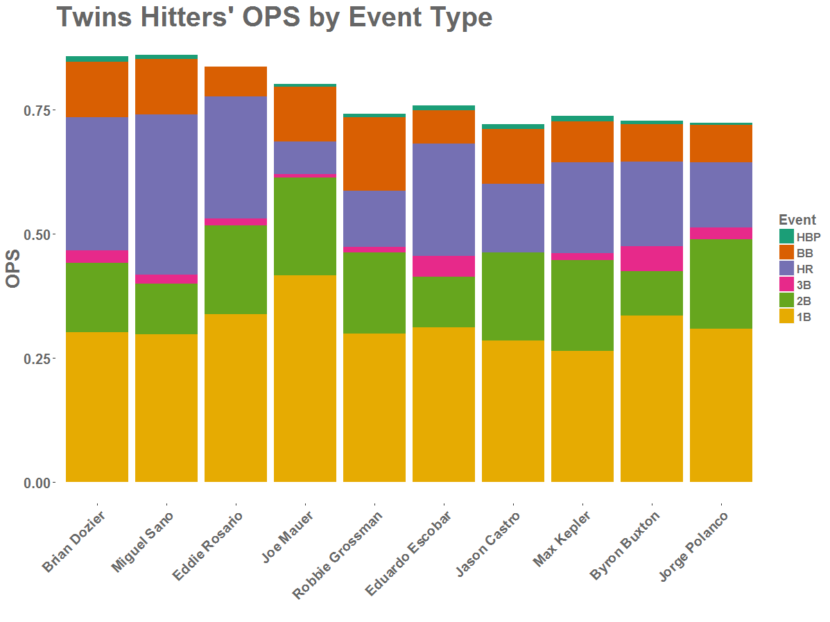
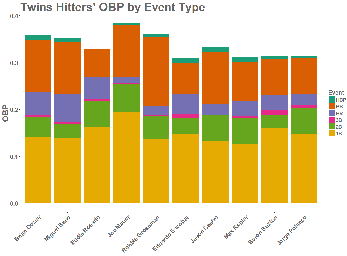
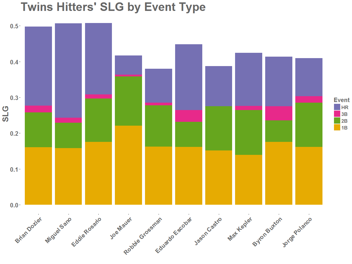
We can similarly break down the component parts of OPS. Note how over half of Miguel Sano’s slugging comes from his home runs, and how nearly half of Robbie Grossman’s OBP comes from his walks.
We can get even more creative. Here’s another look at wOBA. For each rectangle, the width denotes the relative values wOBA assigns to that event, and the height shows the percent of the time that player’s plate appearance resulted in that event. The area of the whole stack of boxes is equal to that player’s wOBA.
To see how this could show the differences between players, take a look at an overlay of Rosario and Mauer’s plots. Mauer’s is taller because a higher percentage of his plate appearances end in a positive outcome. Rosario’s is fatter because his plate appearances result in more high-value outcomes (extra base hits) than Mauer’s.
Are these stacked-box visualizations great? Probably not, though I do like them. The eye finds areas harder to compare than lengths, so these plots are probably hard to wrap your head around. And in any case, they’re pretty goofy looking. But they show component parts of offensive statistics in ways that are often overlooked, and they’re a lot of fun!