In this week’s My Model Monday, I explored aging curves in not just the NHL, but in other professional leagues and junior hockey leagues. First and foremost, what are aging curves? Aging curves are just what they sound like: curves that associate player performance and health over time. For a point of reference, despite his mighty accomplishments at an old age, Jaromir Jagr saw his point production dip from over a point per game at age 25 to about 0.3 PTS/G at age 45. Jaromir Jagr is an incredibly interesting case and likely outlier, as few players have played into their mid-forties. At any rate, one can imagine that many players experience similar increases and decreases in production with age; therefore, using many samples of players, one can construct a curve that resembles a mean of all players aging, or, as we like to say in the reinsurance industry, an industry exposure curve.
Methodology
In the sports analytics community, aging curves are far from a newly explored topic. For instance, Mitchel Lichtman, Tom Tango, and others have utilized the “delta method” for computing aging curves, which looks at all players who played in back-to-back years. For every player, it takes the difference between their rate of performance in each sequential pairing of years and puts that difference into a “bucket,” which is defined by the age of the player in those sequential years. Simply enough, right? For an example, one would take Patrick Kane‘s 24th and 25th age seasons, calculate the difference in performance and place the change in performance into an age band or bucket labeled 24/25. In order to extrapolate this for the entire NHL, one would compute the change in performance for players that played in the NHL at age 24 and 25, accumulate the change in performance divided by the number of players that fall into that age band. One may note that this method weights everything equally. In my investigation, I found little/no difference in results from implementing any sort of weighting method by games played or TOI.
Measuring Performance
The next question becomes, how do we measure player performance? For this article, we will use points per game, given the available data for leagues outside of the National Hockey League. Others, such as Rob Vollman, have explored aging curves using points, goals, assists, Face-offs and more. EvolvingWild at Hockey Graphs details his approach to aging curves using Dawson Springs WAR here. EvolvingWild’s article takes it a bit further than we will go in this investigation by breaking out positions, Even Strength vs Power Play, and more.
NHL Aging Curves
Although there has been plenty of work done on NHL aging curves, I explored them in order to show comparisons to other hockey leagues. To help further illustrate the idea of aging curves, I pulled a random sample of a few NHL players’ points-per-game production by age. Age is measured in years at the start of the NHL season. 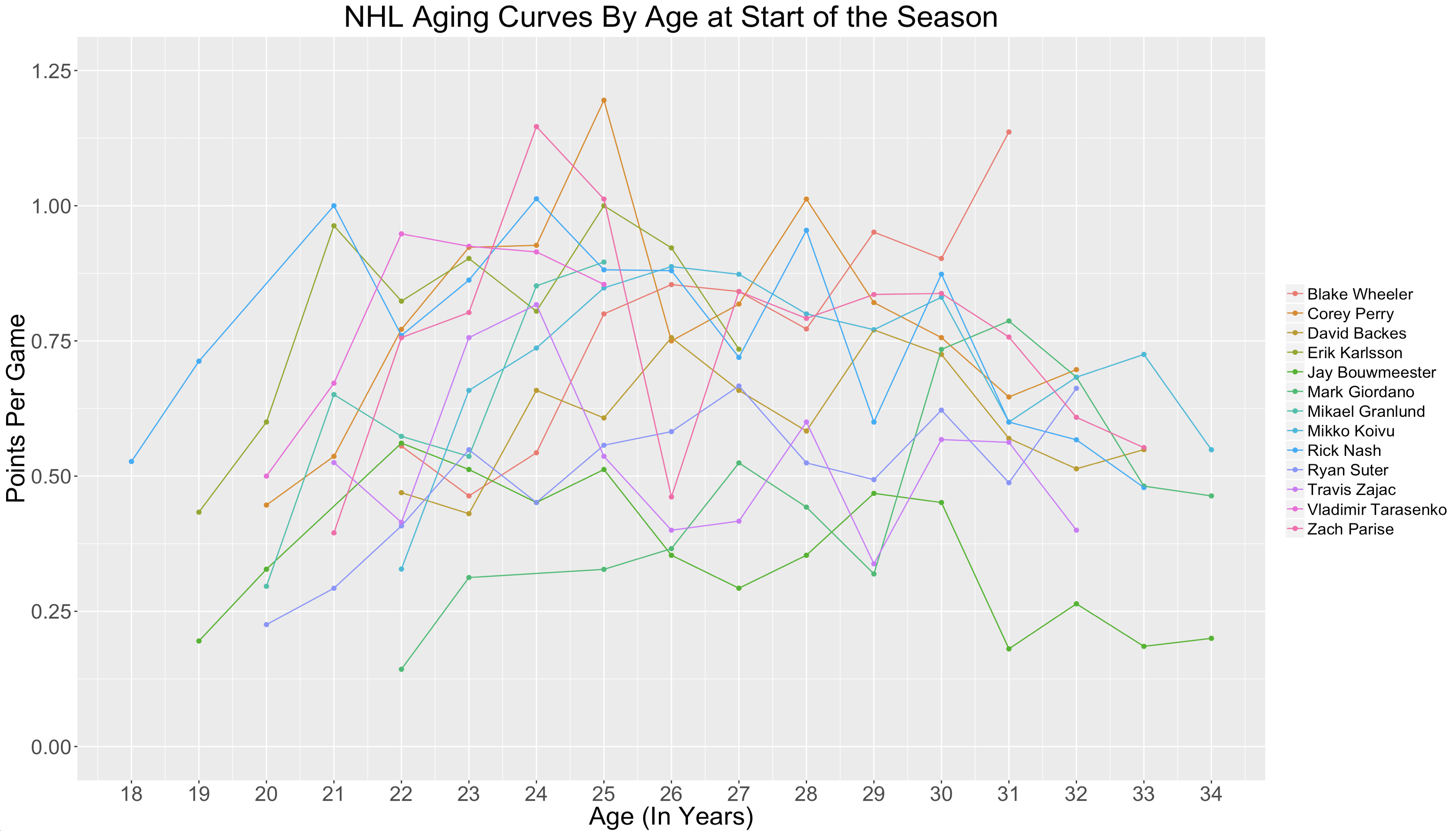 Almost every player above shows significant increases in their first few years in the league (ages 18 through 22). From this small sample, peak point production occurs roughly between 22 and 26 (which is not true for everyone—Blake Wheeler just set a career high at age 31). Expanding our sample to the entire NHL, below is a table of the average change in Points Per Game by Age Band.
It appears our small sample looks to somewhat represent the whole. Similar to previous research, peak point production occurs between the ages of 22 and 25 with more of a plateau across the aforementioned age range than an actual peak. Additionally, players usually do not experience a decrease in point production until their Thirties.
AHL Aging Curves
The American Hockey League offers a more complicated system of player movement than the NHL. Players in the AHL are often younger and developing to play in the NHL. Even contrary to many professional European leagues, players rarely play into their thirties in the AHL. Similar to the NHL, the plot below illustrates a few individual examples of Player Aging curves: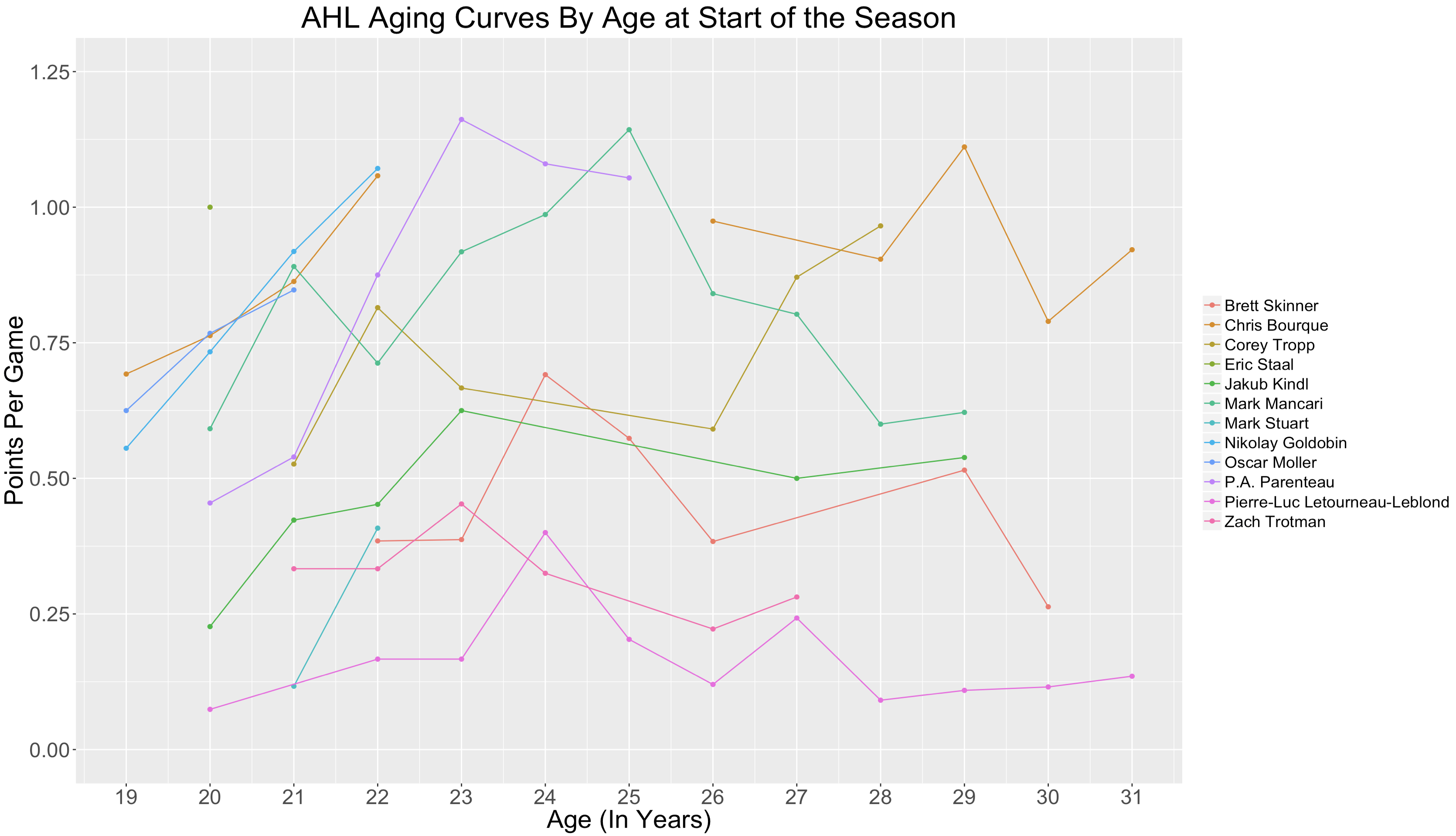 The sample of players above aligns with the intuition that young players show significant development early on. Some players return to the AHL later in their respective careers, as they remain fringe NHL players; those individuals can be seen through breaks in the graph. As one might expect, players that return to the AHL late in their career do not appear to experience notable increases in point production.
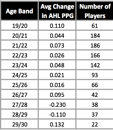
NCAA Division I Aging Curves
Moving down the chain in age and competition level, we next look at NCAA Division I Men’s Hockey. Players range in age roughly from 17 to 25, although a high majority are between the age of 18 and 24 at the start of each respective season. For those unfamiliar, NCAA provides a natural stepping stone before the AHL and NHL. As seen in the individual age curve below, a number of NHL players have played multiple seasons in the NCAA before making the jump: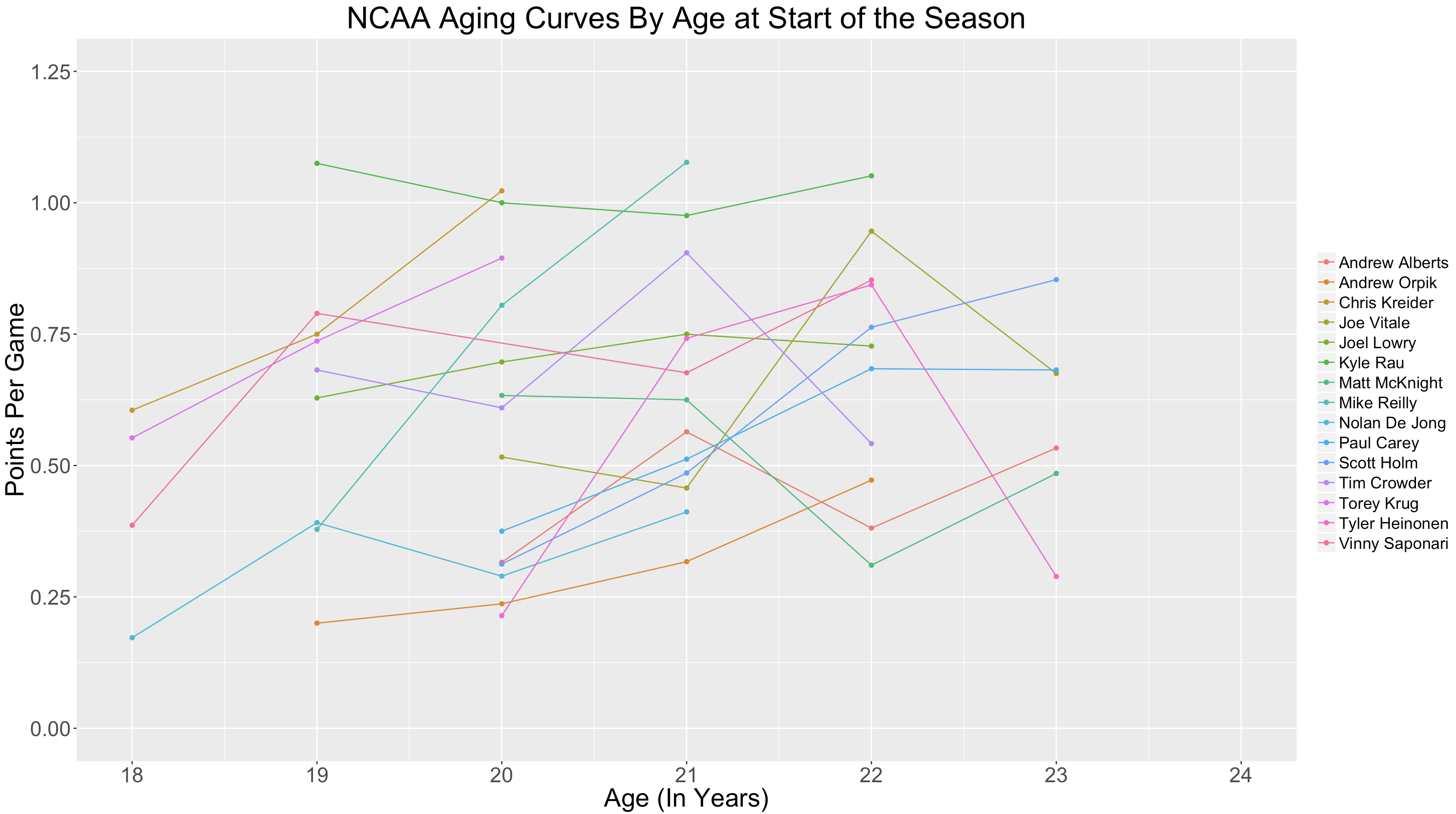 This will sound like a broken record, but again there is significant development shown through increased point production in a player’s 18, 19, and 20 aged seasons. After age 22, players start to level out or even experience a slight decrease, as seen in the average aging curve below. Whether that’s a product of too much college drinking or older players inherently being less skilled and playing a more defined role with less opportunity, it’s interesting nonetheless.
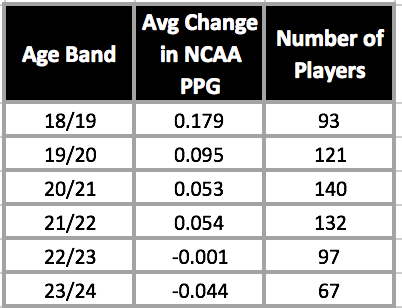
USHL Aging Curves
Let’s continue down the path of United States Hockey Leagues. The United States Hockey League (USHL), known as the top junior hockey league in the United States, consists of players under the age of 21 and feeds directly into NCAA Division I hockey. While I am unsure of any minimum age restriction, in our database players have played in the USHL as early as 14; thus, our sample will deal with players roughly 14-20, a time in which my biology instincts suggest that humans often experience significant physical growth. Below plots a few randomly selected USHL players’ points per game production by year in the USHL: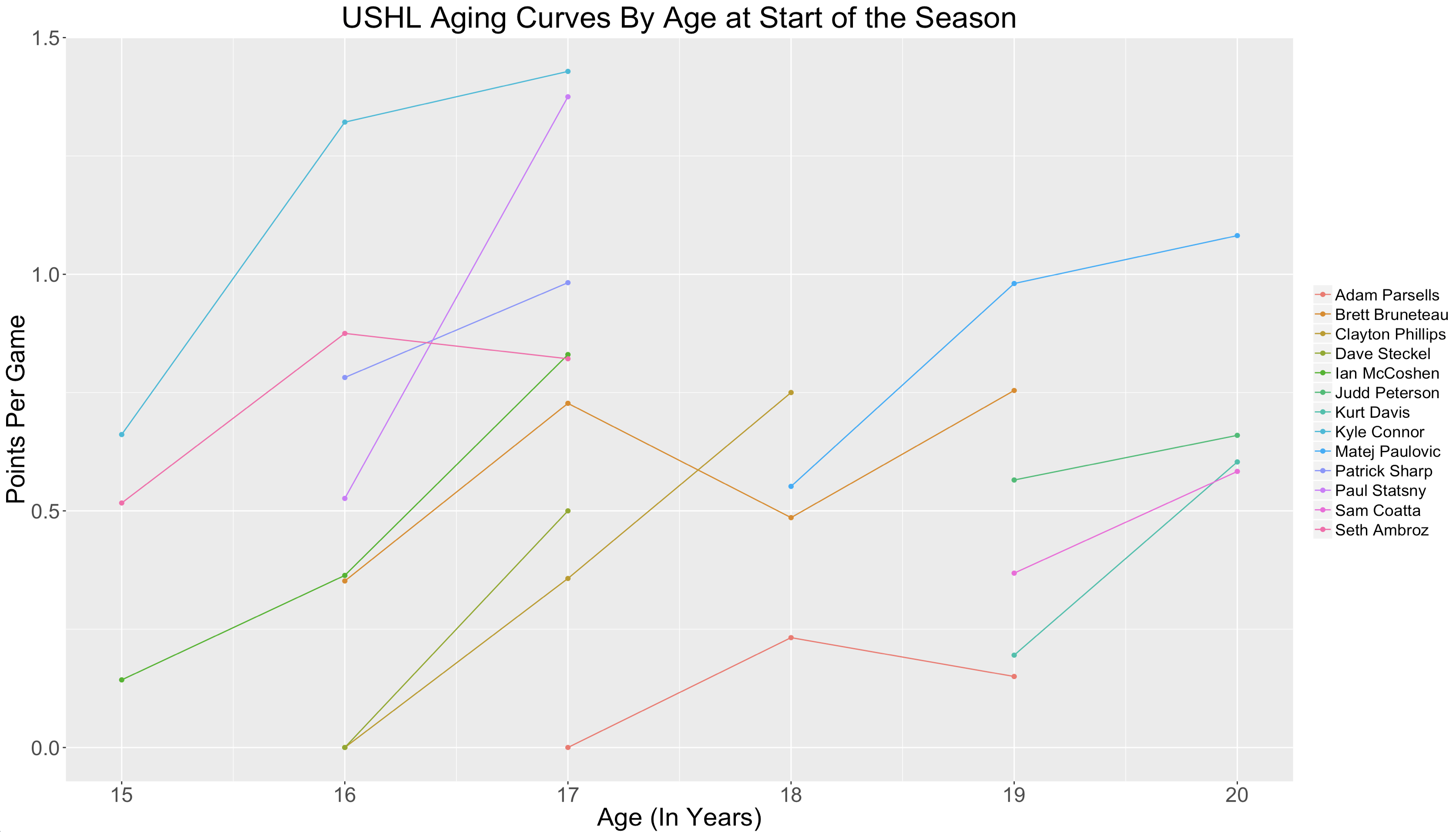 As one might expect, there appears to be much steeper curves and almost no downward sloping curves at any age band, compared to the NHL, AHL, or NCAA. Part of this can likely be attributed to physical growth. Furthermore, if a player regressed significantly that player might be dropped to a lower junior hockey league such as the NAHL. Extending our sample, below is a table of the aging curve for the USHL.
 Based on the aging curve, except for older players, (19 and 20) a player’s second year in the USHL, regardless of age, is likely to be (significantly) more productive than his first year.
KHL Aging Curves
Obviously, It would be impossible for me to write this article without the KHL. So let’s move across the pond to the great country of Russia. The KHL is probably the league most similar to the NHL in that players do not leave as often for another league (yes, players leave for the NHL, but sometimes not at all or until they’ve played years in the KHL). Therefore, entire careers can be captured in this professional league. The plot below shows a few KHL individual aging curves: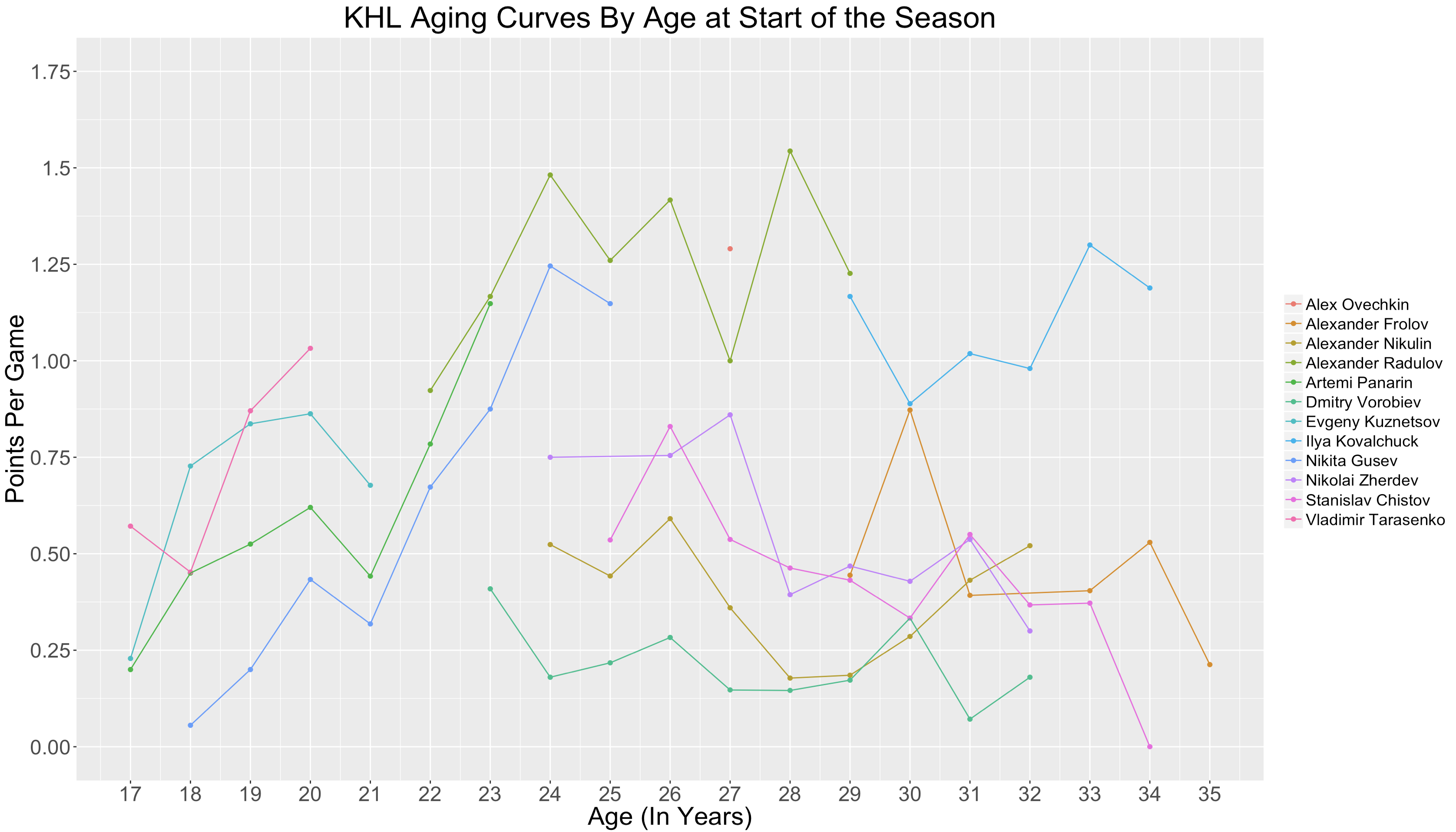 The breaks in the curves are mostly due to players leaving for the NHL. Since top prospects such as Evgeny Kuznetsov and Vladimir Tarasenko often don’t come to the NHL until their early twenties, a more substantial amount of data on those years can be collected and used in an aging curve for the KHL compared to some of the other European hockey leagues.
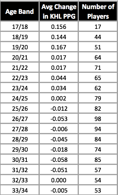 Albeit a lesser sample of players, the KHL aging curve measured by points per game eerily mirrors the NHL curve (i.e., peak point production reached by 24/25, significant growth from 17 through 20, and a slow decline in the late twenties through thirties). While we won’t go through all leagues in this article, in my investigations most professional leagues’ (e.g. SHL, DEL, etc.) aging curves follow a similar pattern.
Final Remarks
Aging curves can be helpful a helpful tool in quantifying/estimating player development over time. However, there are a number of situational factors such as change in level of teammates performance, injuries, league changes, etc. that make each player’s individual curve look slightly different. These curves have been especially useful in our translation factors methodology. Our translation factors are derived from a range of ages, and, thus, we need to adjust point production to each respective league’s mean age to more accurately translate players across leagues.