Imagine you’re the analytics director for the Cleveland Cavaliers. After the Cavs added a bunch of new players at the trade deadline, coach Tyronn Lue might come to you for advice on how best to fit them into lineups. Luckily, your team of analysts has already designed a Lineup Evaluator Tool to rate and score any five-player lineup. But that doesn’t quite get you where you want to go. You need to take in the players on the Cleveland roster and spit out a ranking of lineups. You need to get a feel for the best player and the best two-man, three-man, or four-man groupings to fit into your game plans.
You need Model 284’s Lineup Optimizer Tool.
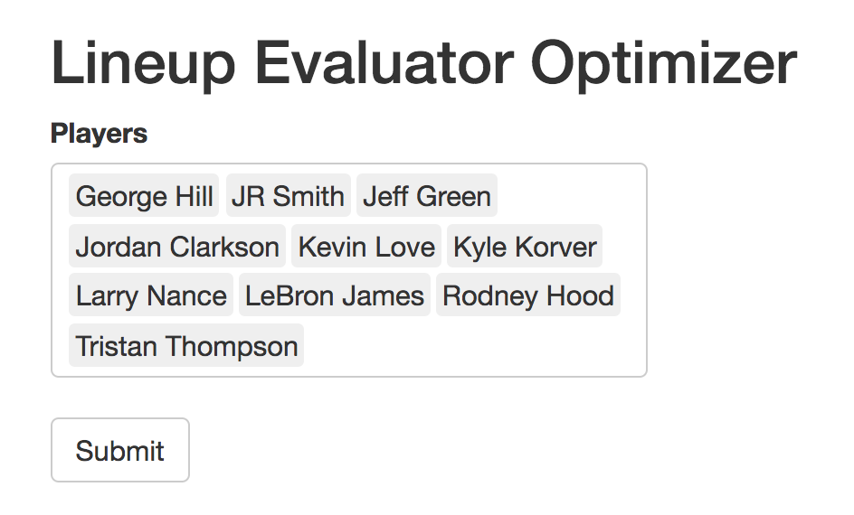
Here’s how to use it. Enter in some players and hit optimize (be careful of entering too many players or it will take a while to run! A roster is doable – the whole league probably is not). For our purposes, we’ll plug in the Cavalier roster (save for a couple of players missing from our data set).
After a brief wait, a couple of tables will appear. The first is a sortable list of all possible lineups. By default, it’s sorted by predicted net rating, with the best lineups on top. By clicking on the column headings, you can also sort by predicted offensive or defensive rating. LeBron appears in nine of the top ten lineups in our table, so the most obvious conclusion is that the Cavs should start LeBron. (Advice like this is why analysts get paid the big bucks). There are more interesting insights to be found, though. In the first three lineups, LeBron is presumably serving as the point guard, which suggests an interesting lineup composition. Additionally, we see other names frequently popping up in the top lineups, such as Kevin Love and Larry Nance Jr. But overall, this view can be overwhelming. And furthermore, the predicted net ratings are pretty close together for these top lineups, so this ranking could be pretty noisy. We’ll need a method to summarize the information in a way that’s useful and more stable. 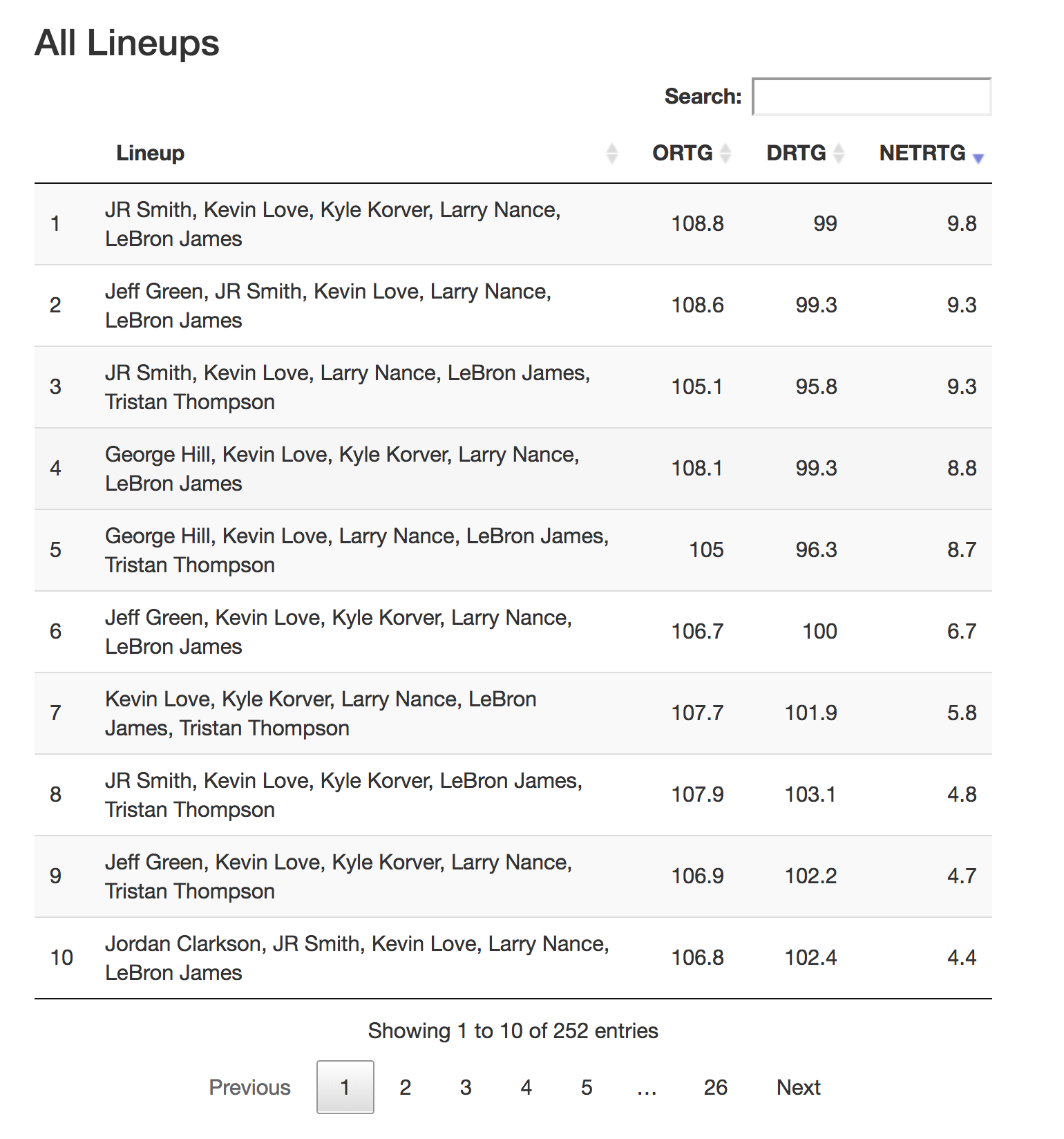
For this reason, the second section of our tool allows us to look at individual players, pairs, or larger groups, ranked on one metric: how many of the top twenty lineups featured that player (or that whole group of players). In other words, if you set it to 2, the output table will consist of every possible pair of players ordered by the number of top-20 lineups containing that pair. (Why 20? That exact number is arbitrary, but it seemed like a good middle ground between singling out the best of the best but keeping enough lineups to remove a lot of noise.) 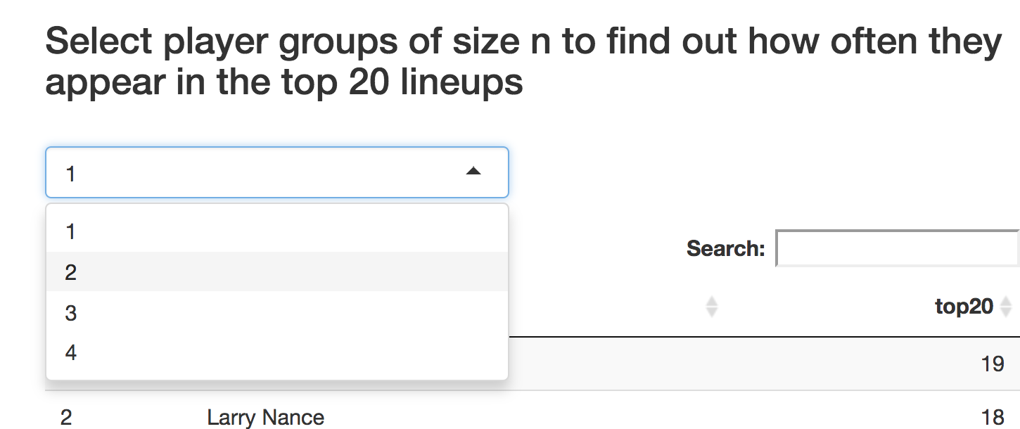
The simplest case (setting 1) just shows each player’s top-20 appearances. These results fit with our earlier conclusions: LeBron James is the best player, with Kevin Love and Larry Nance Jr. coming in second and third. Kyle Korver rounds out the top four (a welcome sign for spacing devotees). 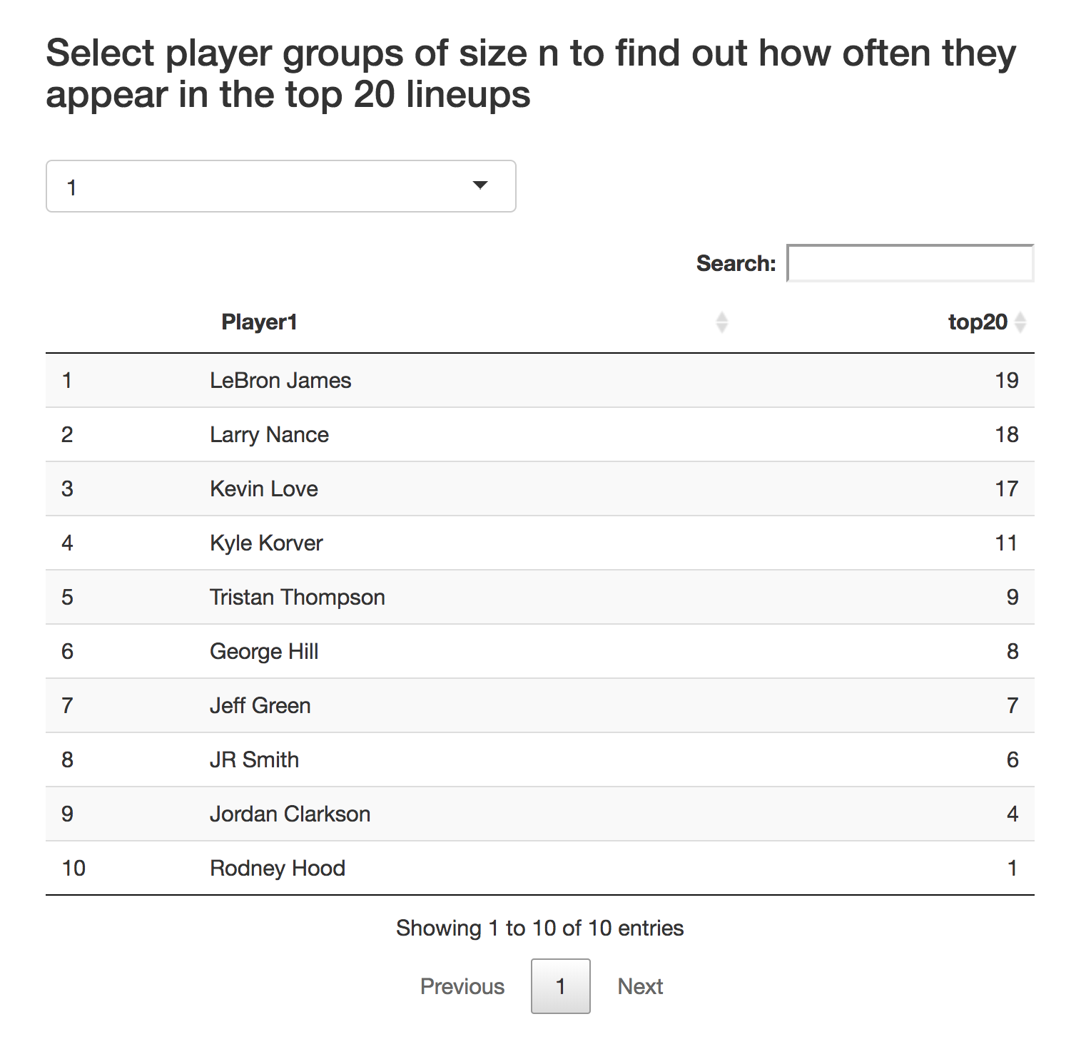
The top pairs look like an extension of the top-20 appearances. The top six pairs mix and match from our previous top four: James, Love, Nance, and Korver. Two pairs containing George Hill also make the top ten, hinting at a potential fifth starter to round out our lineup. 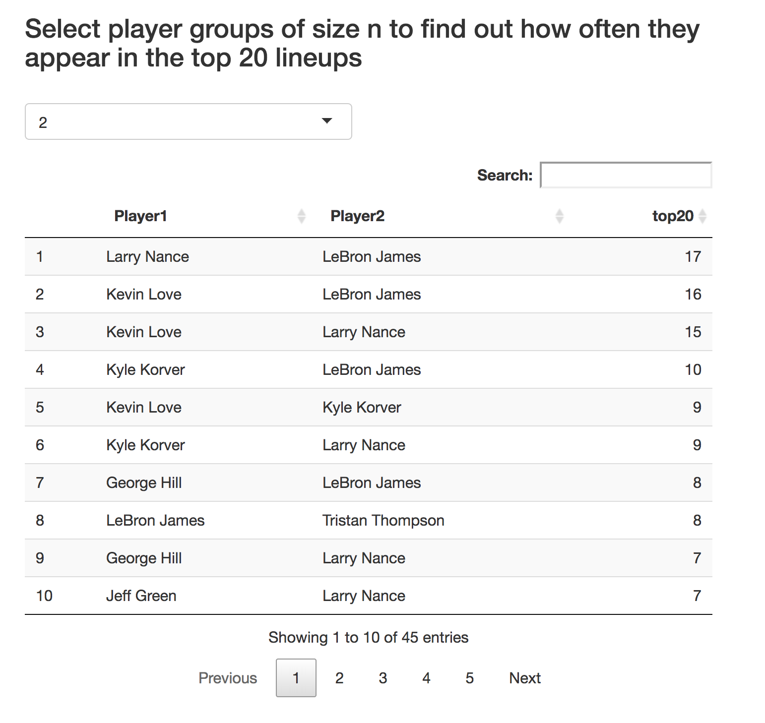
This George Hill trend continues in the groups of three; after some top groups containing the “big four”, Hill appears a couple of times in the top ten. 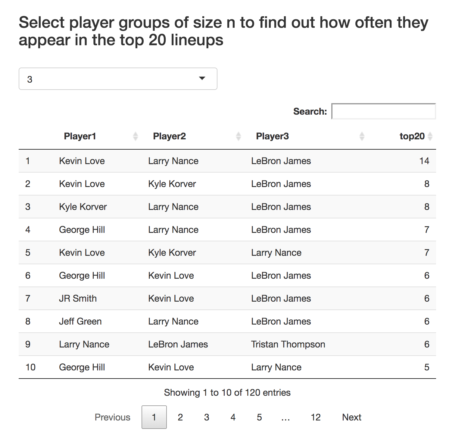
Finally, you can look at groups of four, which could be useful if you feel you have a strong core four, but no clear-cut fifth. Again, Hill appears.
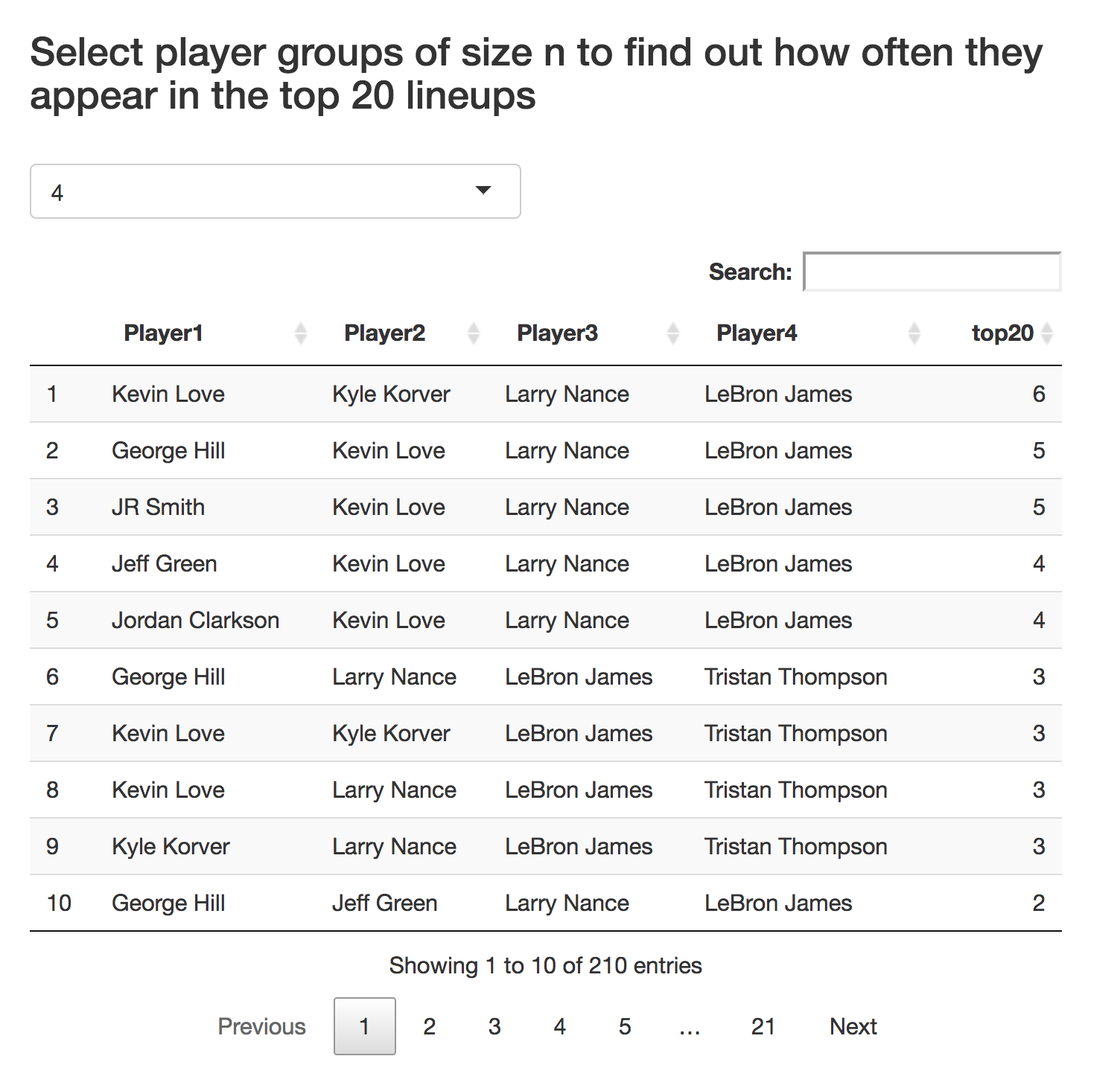
It looks like the ideal Cavs starting lineup is: James, Korver, Nance, Love, and Hill. If we were interested in compiling bench lineups, we could repeat this process, deleting the aforementioned players.
This process of sifting through these outputs to draw conclusions about the Cavs’ top lineup seems pretty cut and dry, but it’s obviously not a complete, perfect solution to be applied in all scenarios. As one example, our tool doesn’t take into account the opposing lineups, and some lineups might be better suited to match up against certain opponent lineups. More generally, this is all based on a predictive model and all the inherent imperfection that comes with it. But an analyst’s job is to determine what the data is telling us and use that to then paint a useful picture. This tool can be a helpful aid in that task.